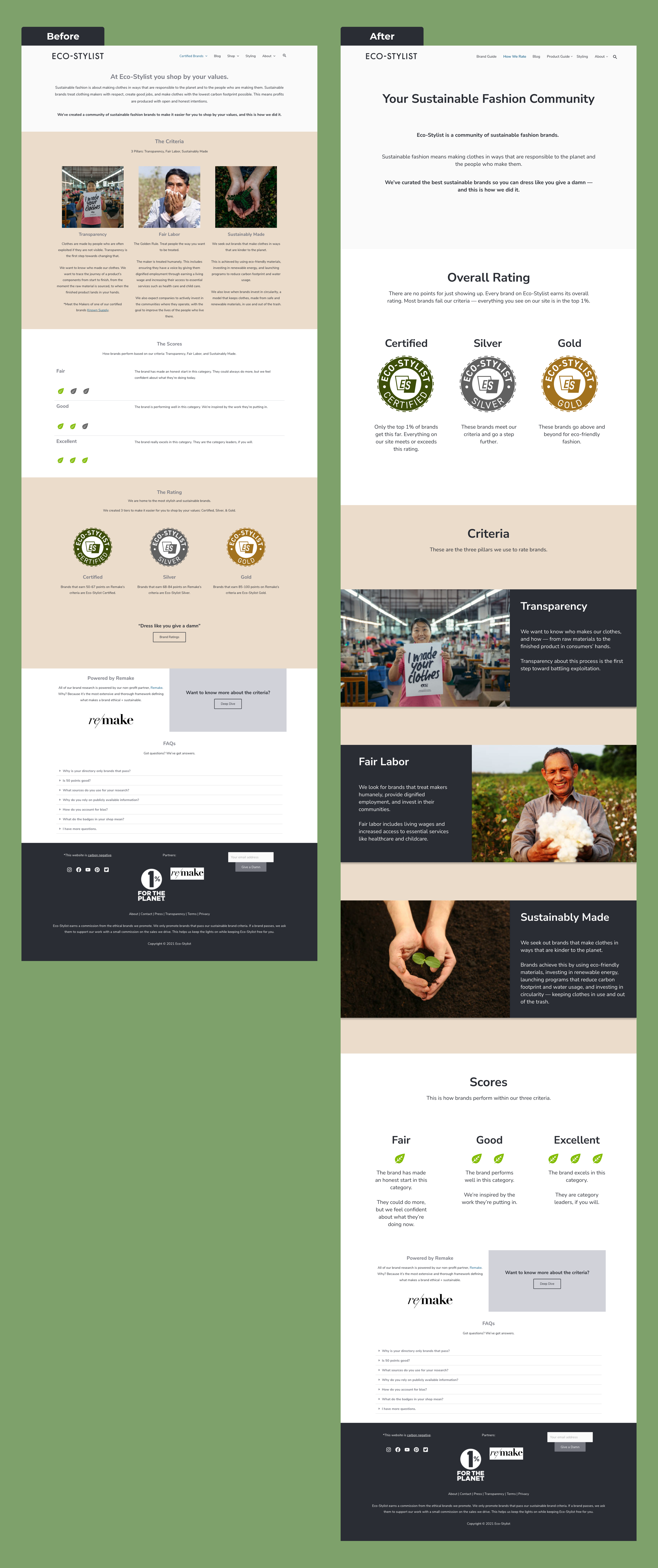
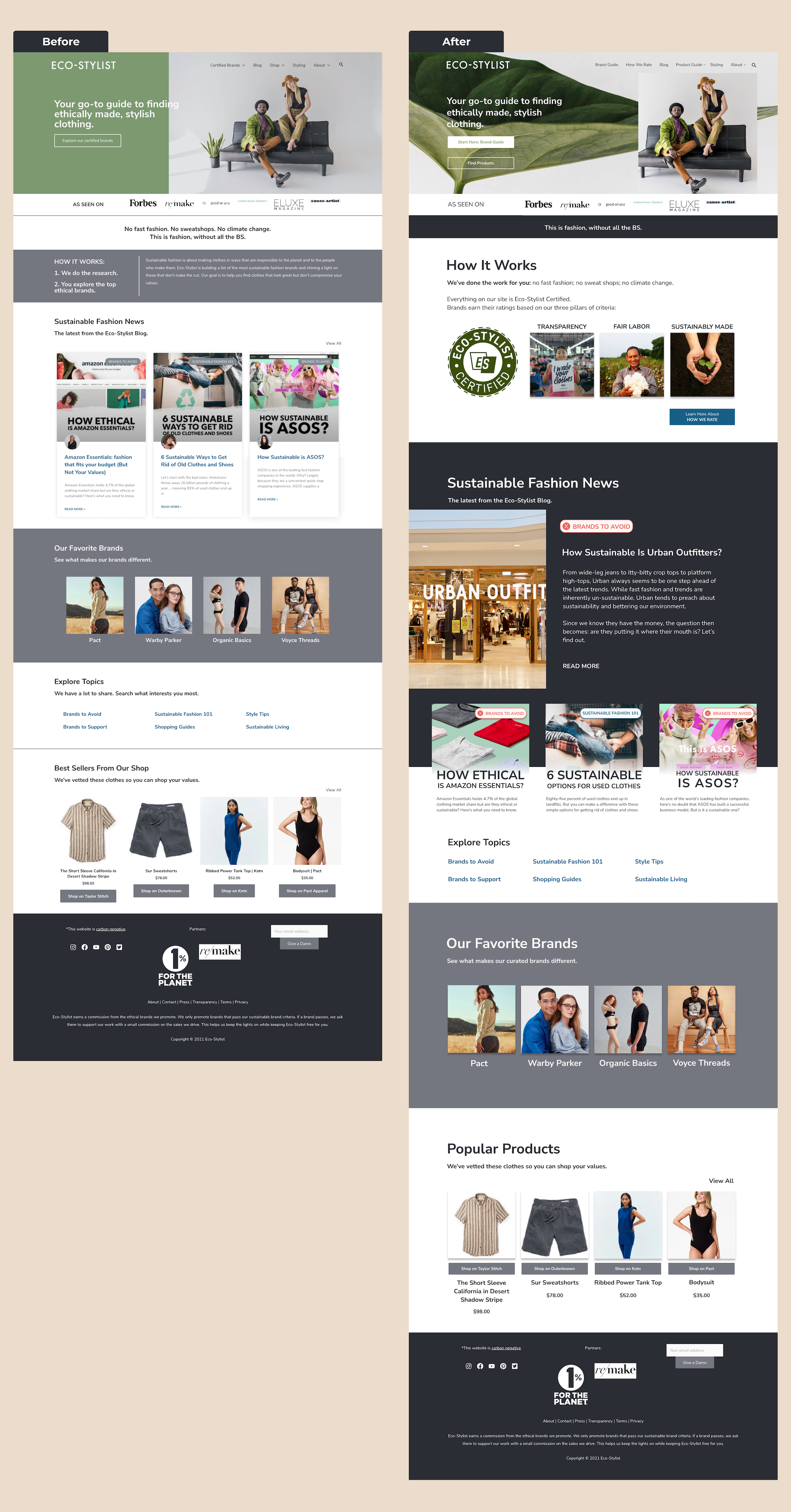
I first focused on revising the copy on this page in order to reflect the intersecting business and user goals. Users felt overwhelmed by the amount of text on this page, and testing identified several spots where the language could be clarified.
To address this, I rearranged the sections to emphasize information users wanted to see more, primarily the certification badges, and I revised the UI to add greater contrast and visual interest to the page overall.
Key Changes:
• I removed the word "shop" from the page header to avoid e-commerce connotations
• Users liked the motto, "Dress like you give a damn," so I incorporated that language to highlight the brand identity
• I added summaries of each badge level and removed the point information because it confused users
• Eco-Stylist wants to emphasize that all their brands are good and that "Certified" isn't "third place." Users respond well to carefully placed hard data, so I repeated the 1% statistic to communicate this message.