Design Sprint: Gallery Pal

Google Ventures Design Sprint
Project Overview
I created a mobile app prototype to help museum and gallery visitors better engage with artwork they’re viewing in real time, following the Google Ventures Design Sprint method.
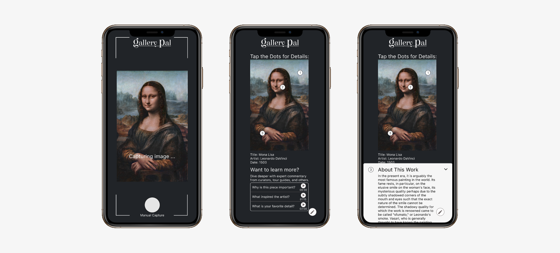
Gallery pal prototype
My Role
UX Designer
I synthesized existing research (user personas / feedback) to make high-impact design decisions
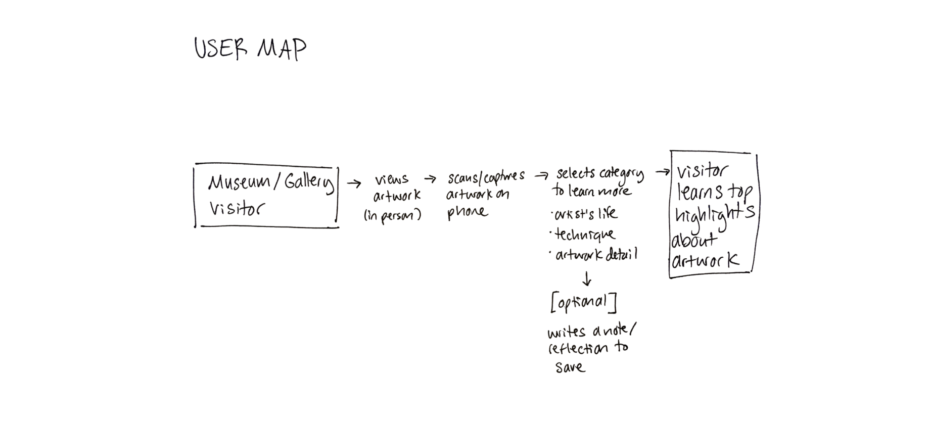
Created a user map
Conducted secondary research on existing products within the problem space
Built a high-fidelity, animated prototype in Figma
Tested my prototype with real users and synthesized feedback

Day 1: Map

Reviewing Existing Research
& Creating User Map
User feedback
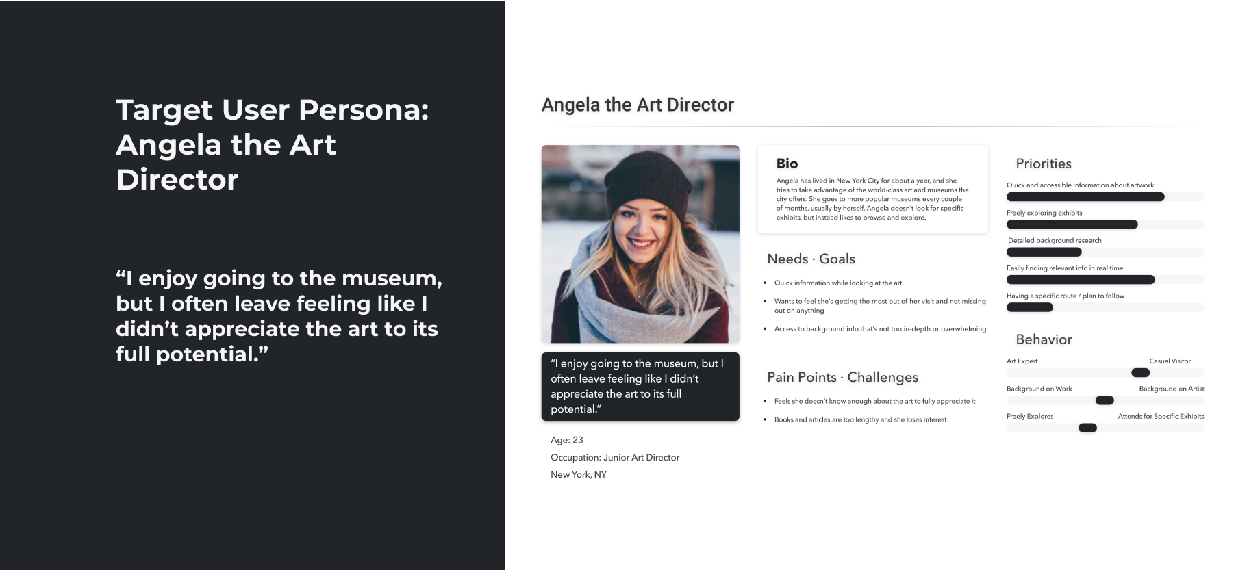
Target Persona
Expert Interview
GalleryPal wants to improve users’ in-person experiences of viewing art in a museum or gallery. While some museum goers do research beforehand, most do not know much about the background or context of the art they are seeing or the artist who created it.

Angela, GalleryPal’s target user persona, is a regular museum-goer who wants to understand more about the background of what she’s seeing; however, she finds researching in books or articles to be too overwhelming and time consuming. She would like quick info and highlights as she views art in real time

Key Insights from User Research:
Users want context, background, and to learn about artists’ story and technique
Viewers would like to move through exhibits freely but also receive selected expert input
Art should help users understand themselves as much as the artist

Day 2: Sketch

Heuristic Analysis
& Solution Sketch
I spent a day reviewing competitor's products and quickly assessing strengths, weaknesses, and areas of inspiration. I examined other museum apps like MFA Mobile, Smithsonian, and Field Museum, as well as the art scanning and image curating app Smartify.

I also considered products that are not within this specific problem space but include features I thought would be useful, such as Scannable and Snapchat, which implement features like opening to camera and defaulting to auto-capture.

Top Inspiration from Existing Products:
• Location-based prompts
• Ability to read information or listen to an audio commentary about the artwork while viewing
• Highlights of specific works of art within a museum
• Ability to scan and capture artwork with phone camera

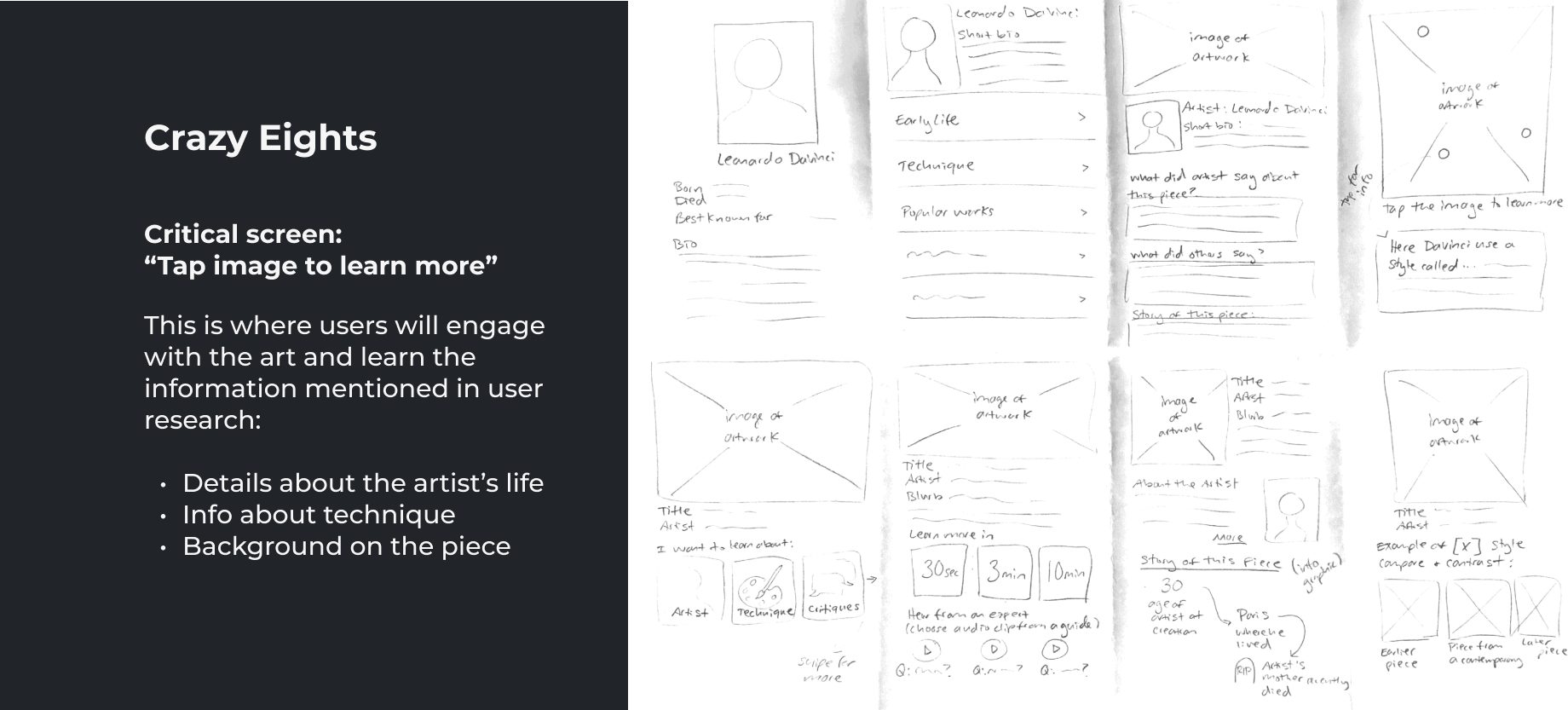
Using this inspiration, I sat down to sketch out many possible options for what I deemed the most critical screen: select info categories to learn more.

Day 3: Decide

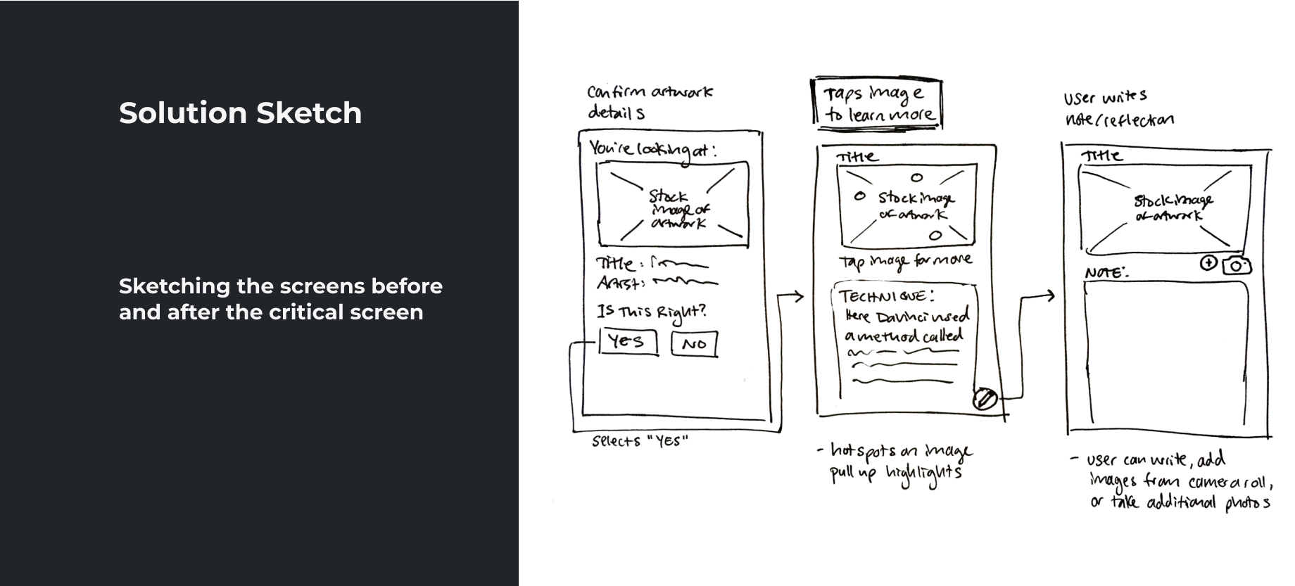
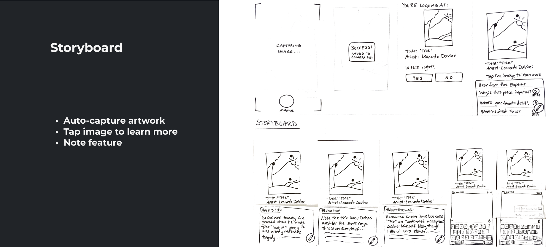
Storyboarding the User's Journey
I chose “tap image” and short audio clips from tour guides as the primary features within my storyboard because they stood out to me as both most engaging for users and also most in line with users’ demonstrated desire to learn quick highlights about the artwork.

I also included a note feature to enable users to write down their own reflections or observations, as well as add their own photos, therefore encouraging users to have a more personal experience with the artwork (something mentioned by the museum tour guide in the expert interview).

Day 4: Prototype

Creating a Prototype in Figma
Key Features:
I chose a dark color scheme for a more professional look that would let the artwork shine, standing out against the background.
Focusing on only the most essential elements of my user flow, I did not include battery / wifi / time info at the top or a navigation bar at the bottom, as these components can be assumed.

Creating an interactive prototype helped me clarify the order-of-events and empathize with users, because I tested my prototype several times to check for errors and ensure the flow was intuitive.

You can check out my complete prototype here!

Day 5: Test

Remote Usability Tests
For testing, I recruited 5 participants with backgrounds and interests that align with my target user: individuals who like to visit museums or art galleries, are artist’s themselves, or have otherwise relevant experience (for example, one of my participants has a degree in architecture and design). 

I conducted interviews remotely via Zoom and instructed participants to share their screens so I could follow along as they moved through my Figma prototype in their browser.

Key Test Findings:
Users liked the clean, sophisticated UI of my prototype, enhanced by the dark color scheme, rounded corners, and minimal features
Users overall liked the addition of the audio clips and were immediately drawn to them, indicating this would be a successful feature
Several users assumed the image dots were directly related to, or contained identical info as, the audio clips, so that is an area where the UX can be improved
Next Steps for Future Iterations
More clearly distinguish between content: info dots on the image vs. audio clips (or, make the choice to follow users’ assumption and have them represent identical info)
Add a menu / navigation bar
Could point users to “Related Works” based on the artwork being viewed
What I Learned
Value of the Design Sprint: A design sprint is manageable to complete as a solo designer, although I can see the benefits of working with a team: having more ideas and inspiration, other designers might see things I miss, the added energy of working with a creative group, and the ability to get even more accomplished by sharing the workload.

Overall Benefits:
Quickly discovering / validating problems
Testing competing ideas (perhaps in simultaneous sprints) to see what works best
Getting momentum when you’re feeling stuck
Gathering data within a time period that is manageable even with limited time / money